Mobile Accessibility: Touch and Navigation
Mobile devices require different accessibility approaches than desktop. Learn about touch targets, screen orientation, and making your mobile experience work for everyone.
Why Mobile Accessibility Matters
Mobile devices changed how people access the web. Over 60% of web traffic now comes from phones and tablets. But here’s the thing — most mobile sites still don’t consider accessibility properly.
People with disabilities use mobile devices just like everyone else. They’re navigating with screen readers, using voice control, or dealing with limited dexterity. Your mobile site needs to work for them. Not eventually. Not after an update. Now.
The good news? Mobile accessibility isn’t mysterious. It’s about understanding how people actually use their phones, then building around those patterns. Let’s dig into what works.

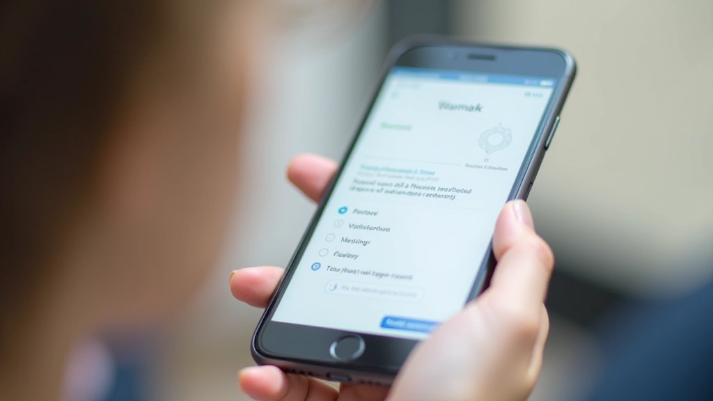
Touch Targets: The Foundation
Desktop users click. Mobile users tap. Those taps need to be accurate, which is harder than it sounds. Your thumb isn’t a mouse pointer.
WCAG 2.1 Level AAA requires touch targets to be at least 4444 CSS pixels. That’s about the size of your fingertip. Not the size of a cursor. This matters because people have different hand sizes, different dexterity levels, and they’re often using phones while doing other things — holding a coffee, walking, sitting in a moving vehicle.
The practical reality? 4848 pixels works better. That gives you a comfortable margin. Buttons, links, form inputs — everything interactive needs this minimum. When you cluster multiple targets close together (like tabs or social icons), you’re asking for trouble. Users will tap the wrong thing.
Quick checklist:
- All buttons minimum 4848 pixels
- Links have at least 8px padding around text
- Form inputs (checkboxes, radio buttons) are 4444 minimum
- Space between targets is at least 8px
- Test on actual devices, not just browsers

Screen Orientation: Don’t Lock It
People rotate their phones. Sometimes intentionally, sometimes not. Your site should handle both portrait and landscape without breaking.
Never force portrait or landscape orientation in your code. Some users need landscape mode because they’re holding their phone one-handed, or their accessibility settings rotate the display to make text larger. Forcing orientation creates frustration and accessibility barriers.
Test your layout at multiple widths. What works at 375px width (portrait) might look terrible at 812px width (landscape). The content should reflow naturally. Text should remain readable. Navigation should stay accessible. This isn’t hard — it’s just about testing beyond your primary breakpoint.
What to test:
Load your site on an actual phone. Rotate it. Does the text stay readable? Can you still tap buttons? Can you access the menu? These aren’t edge cases — this is normal mobile usage.

Gestures and Voice: Accessibility Beyond Touch
Not everyone taps. Some people use voice control. Some use switch access. Some use eye-tracking. Your mobile site needs to handle multiple input methods.
This doesn’t mean rebuilding your site. It means being thoughtful about gestures. If you require a swipe gesture to advance through content, offer a button alternative. If you use pinch-to-zoom, don’t disable it with user-scalable=no. People with low vision rely on pinch-zoom to make text bigger.
Voice control users (like Apple’s Voice Control) need clear labels. A button that says “Click me” doesn’t help. A button that says “Submit search” does. Screen reader users benefit from the same clarity. Write descriptive link text. Avoid “Click here” or “Read more.” Instead use “Read article about mobile accessibility” so people know what they’re clicking before they do.
The real rule: If it requires a specific gesture or input method, provide an alternative. Voice users can’t swipe. Switch users can’t pinch. Give everyone a path forward.
Implementation: Making It Real
Here’s what you actually do to make a mobile site accessible:
Test on Real Devices
Simulators are useful, but they’re not the same as holding an actual phone. Test on iPhone, Android, different screen sizes, and different OS versions. You’ll find issues you missed in the browser.
Use a Screen Reader
Enable VoiceOver (iOS) or TalkBack (Android) and navigate your site without looking. You’ll immediately notice where the experience breaks. Screen readers announce buttons, form labels, and headings. Make sure yours are meaningful.
Check Color Contrast
Text needs 4.5:1 contrast ratio against its background (WCAG AA standard). On mobile screens outdoors or in bright light, low-contrast text disappears. Use a tool like WebAIM Contrast Checker to verify.
Verify Touch Target Sizes
Use your browser’s inspector tool. Select an interactive element. Is it at least 4444 pixels? If not, enlarge it. This single change fixes a huge portion of mobile accessibility issues.

Mobile Accessibility Isn’t Optional
You’ve probably noticed a pattern here. The best practices for mobile accessibility aren’t complicated. They’re straightforward. But they require intentionality. You need to test. You need to think about people using your site differently than you do.
Touch targets matter because fingers aren’t precise. Orientation flexibility matters because phones rotate. Clear navigation matters because small screens are cramped. Simple gestures matter because not everyone can perform complex interactions.
Start with touch targets and navigation. Get those right. Then test with a screen reader. Check your color contrast. You don’t need to be an accessibility expert to make meaningful improvements. You just need to care about the experience for people who aren’t like you.
What’s Next?
Mobile accessibility is just one piece of the larger accessibility puzzle. Explore our guide on WCAG standards, screen readers, and color contrast to deepen your knowledge. Your mobile users will notice the difference.
Explore More Accessibility GuidesAbout This Guide
This article provides educational information about mobile accessibility based on WCAG 2.1 standards. While we’ve made every effort to ensure accuracy, accessibility requirements can vary by jurisdiction and specific use case. Always consult official WCAG documentation and consider working with accessibility professionals when implementing changes to critical systems. This guide is informational and not a substitute for professional accessibility auditing or legal advice.
Related Articles

WCAG 2.1 Levels Explained: A-AA-AAA
What’s the difference between A, AA, and AAA compliance? We break down each level and help you understand which one matters for your project.
Read Article
Screen Readers and Assistive Technology
Understand how people with visual impairments navigate the web. We’ve got tips for making your site work with screen readers.
Read Article
Color Contrast and Visual Accessibility
Color alone isn’t enough to communicate meaning. We’ll show you how to meet contrast requirements and design for color-blind users.
Read Article